-
Architects: L.E.FT Architects
- Area: 100 m²
- Year: 2016
-
Photographs:Iwan Baan , Ieva Saudargaité
-
Lighting Design: Hilights, Maurice Asso

Text description provided by the architects. This small mosque of 100m2 included a renovation of an existing masonry cross-vaulted space and the addition of a minaret, grafted onto the existing structure as a symbolic landmark, next to the 18th century old palace. A new civic plaza was created in what was before an adjoining parking space, turning the frontage of the mosque into a public square with seating, water fountain, ablution space and shading under a newly planted fig tree.

Given the non-alignment of the existing structure with the required directionality to Makkah, the design approach was first set to correct the orientation though a series of physical transformations and additions. The directionality towards Makkah became the only tool/language mobilized to shape the new mosque and its surrounding, at all scales, from the interior of the mosque to the outdoor plaza

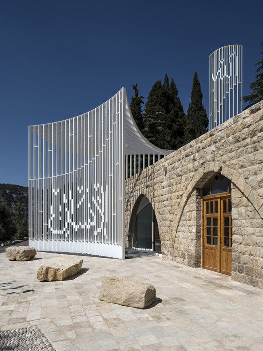
On the architectural level, the mosque’s new slender minaret is linked horizontally through a gently concave canopy to a curved wall at the plaza level, delineating a portico for the mosque below and creating a transitional space between the interior of the mosque and the street as well as adding privacy for the mosque from the outside.

The envelope of the mosque is strictly formed of thinly sliced painted white steel plates, faithfully angled in a parallel direction to Makkah. When looked at obliquely from an angle, the steel plates stack to compose a complete and comprehensive volume of the mosque. Looked at frontally, the mosque’s volume, through its thin planarity, disappears and blends with its visually rich historical backdrop, momentarily suspending belief in its actual presence.

Rather than the traditional inert Cube/Dome/Minaret volumetric expression of normative mosque architecture, the design offers a lighter reading of the typology, an ephemeral tectonic presence. The concave/convex planar surfaces of the new mosque brace the outside plaza and street in an extroverted geometry, and link it to the interior religious space which would have been usually hermetically enclosed. As we now know, these two spaces (the religious space within and the public space of the street without) were hybridized in the ‘Arab Spring’ uprisings where the public space of the city intersected the public space of the mosque.

Structure/Ornament/Words/Sounds
Atop the minaret, the word Allah (God) is folded bi-axially from the minaret’s elements, becoming an integral structural element that is reinforcing the fragile steel armature, rather than being just an ornamental applique. The minaret becomes a frail element that without this calligraphy would fail structurally and break apart. Seen from one side, Allah is read in an affirmative solid form, a modern interpretation of calligraphy. Seen from the other side, Allah is read as a void, a doubtful absence, but also emanating the immaterial and ineffable idea of God, in reference to the lack of representation in Islam. It is also a deconstruction of the word from a metanarrative to a text that can be interpreted, through the creation of a physical rather than an optical lenticular. Here, the text is literally a construct, and writing/reading happens between the lines. The Minaret itself is the same height as the surrounding trees; and when seen frontally becomes transparent to blend with its context.

Below, at the curved wall entry to the mosque, the pixelated and equally structural word Insan (Human) is added to the steel plates, to create a Hegelian dialectic of God/Man. The juxtaposition of both renders the idea of humanity as an integral part of the equation with God, placed in a new dialectic, and becomes a reminder of the humanistic tradition of Islam, as referenced in noted Islamic theologian Mohammad Arkoun’s book Humanisme et Islam – Combats et Propositions (Paris, Vrin, 2005) which places Islam at the origin of the18th century Enlightenment project.

Insan becomes the epicenter of the ground plane of the plaza.
As one moves around the mosque, the planar reading of the mosque formed by the steel plates becomes transparent, while the two words (Allah/Insan) becomes more apparent, and vice versa. The overall lightness of the mosque’s tectonic sits also in a relational contrast to the heaviness of the Moukhtara’s palace stone volumetric.

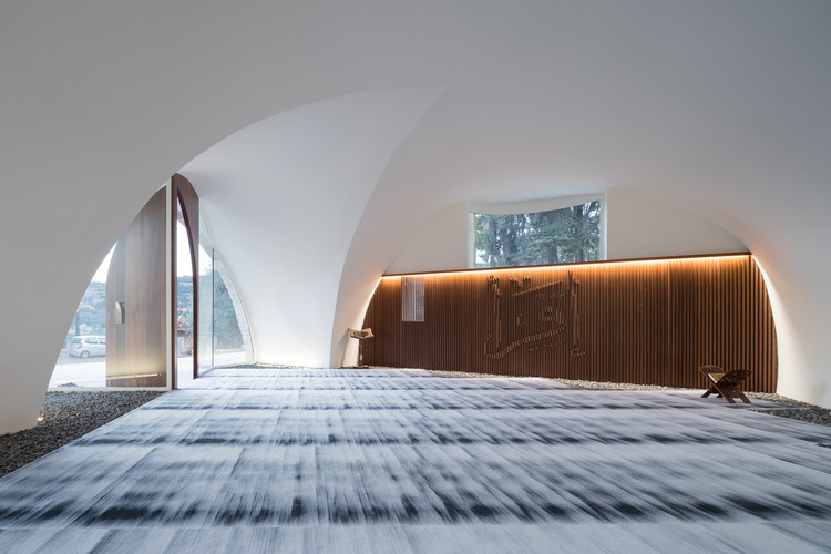
A fig tree shades the new plaza, and creating a book end along with the existing Olive tree on the other side of the street, alluding to the ‘Fig and Olive’ verse (souret at-teen) in the Quraan and referencing the importance of both trees in Christian tradition as well. At the threshold, the entry to the mosque’s hall, which accommodates both women and men in the same space, is articulated with a chiseled glass façade holding two wooden doors that float within it.

Interior
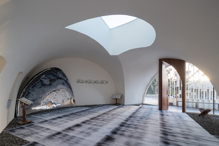
On the inside of the existing structure, the minimal intervention involved a ‘white-out’ of the concave surfaces of the vaults, using special Lime mix brought from Aleppo in Syria, as well as the introduction of a new skylight that cuts the vaulted space to register the direction of the Quiblah wall towards Makkah, and bring light towards the Mihrab space.

Through the skylight, one can see the minaret in a visual looping of exterior back to the interior, linking visually the disassociation in typical mosques between the sound and the vision.

Similarly, the Mihrab is articulated with a concave reflective polished stainless steel arched wall that, though pointing towards Makkah, implodes this axiality by merging it visually with the wider context, bringing outside in, and distorting the interior spatiality of the mosque.

Towards the back of the mosque where the actual reading of the Quraan would happen, a wooden wall with the word iqra’ (read) is articulated in relief. It references the Islamic scholar Youssef Siddiq’s argument and interpretation that the first word in the Quraan, iqra’, of which the Quraan word is a derivative, argued for a critical and contextual reading of the Quraan as a post-structuralist ‘text’ to be read critically, and not as a meta-narrative to be recited blindly.

The call to prayer, in collaboration with artists Lawrence Abu Hamdan and Nisrine Khodr, was re- interpreted along the same lines as a variation on the normative call to prayer by the idea of having it spoken rather than sung, in a return to the words where the listener focuses on the meaning rather than the melody.

Overall the design of the mosque is a celebration of the ethos of modernity as it relates tectonically to the notion of abstraction, of ephemerality, and representationally to the continuity of the humanism tradition in Islam. It represents a part of a cultural war of ideas that needs to be fought against the fundamentalist forces across religions, a war where architecture is a weapon.


